

I prefer them to current look.
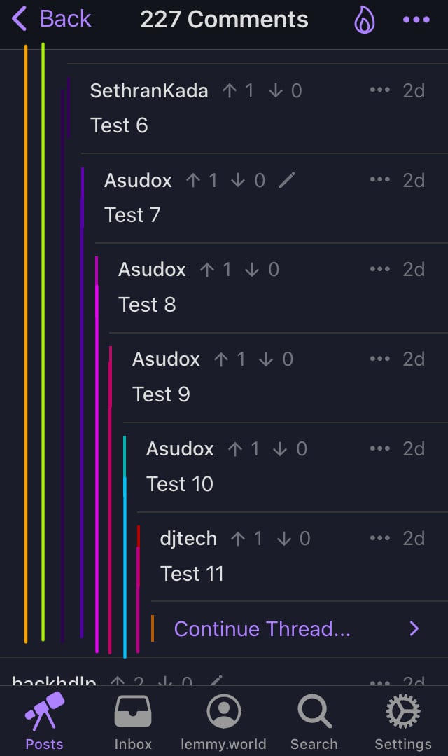
Screenshot taken from comments to posts testing max nest depth.
Honestly I don’t really like the way that looks
yeah, way too noisy for the eyes, and it doesn’t really add any information
After 1.22 update these lines aren’t going to cover half of the screen. Do you think it still would look noisy? I like how in code editors nest lines visually indicate nest depth, but lines aren’t colorful there.
The colors not covering half of the screen would definitely be an improvement. The other thing I don’t really like is how it gives the nested comments very little room, it’s a little harder to read when it’s crammed into a small spot like that.
Oh I just released extended nest lines wouldn’t play nice with swipe gestures on comments.
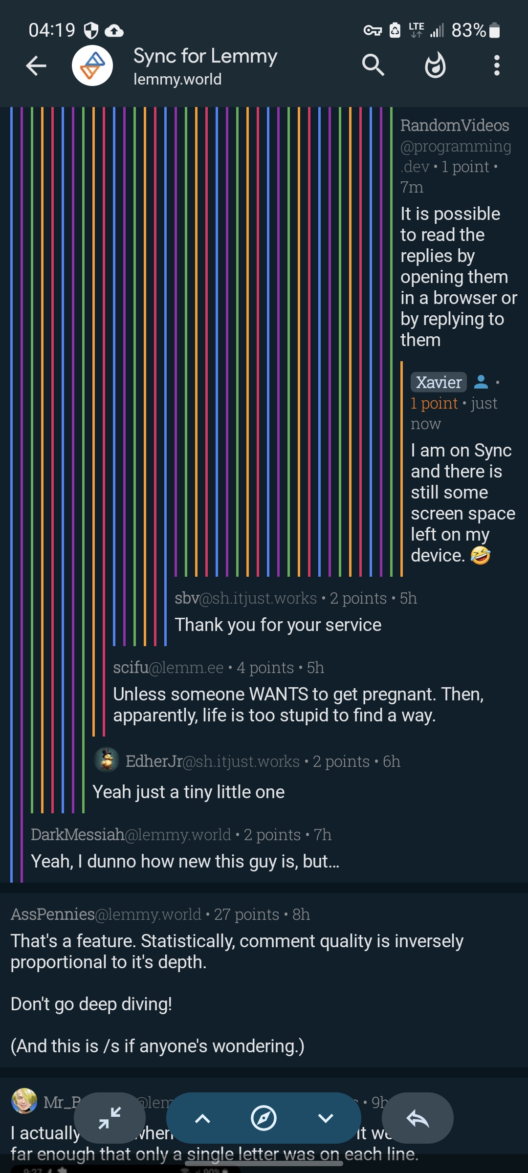
The other thing …
Isn’t it the same thing? Extending nest lines won’t leave less space for comments, lines would take already available space. And after 1.22 update comments have more space on deeply discussion. Consider my image editor driven mock-up:
Reddit showed it was a bad idea
That would be great. Sometimes the short lines are confusing. It would actually work with lines all the same color then.