Mostly just a Touhou and progressive rock enjoyer.
- 2 Posts
- 11 Comments

 52·10 months ago
Good opportunity to say how annoying are update notes like “We are continuing to improve our application. We fixed a couple more issues to make it more stable”. Corporate style, uselessness and the fact that this update can contain some stupid redesign is disgusting.
there are peoples who create instances for their families, who is going to manually federate with all these small instances?

 32·1 year ago
is EU based or something

 131·1 year ago
Rock melting in lava

 2·1 year ago
Oh I just released extended nest lines wouldn’t play nice with swipe gestures on comments.

 1·1 year ago
The other thing …
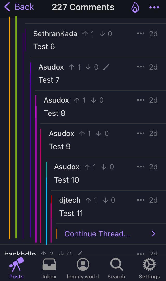
Isn’t it the same thing? Extending nest lines won’t leave less space for comments, lines would take already available space. And after 1.22 update comments have more space on deeply discussion. Consider my image editor driven mock-up:


 2·1 year ago
After 1.22 update these lines aren’t going to cover half of the screen. Do you think it still would look noisy? I like how in code editors nest lines visually indicate nest depth, but lines aren’t colorful there.
ipa available in GitHub releases🍺
if you have a Mac
i don’t have it
Can I just download ipa file? I don’t want to wait

“Hidden posts” section and reset button is what I needed, thanks