
Well, if I remember my software engineering prof correctly, software engineering is mostly about bringing an engineering mindset to software development. You wouldn’t just slapdash an airplane together in a weekend and shove it out on the runway. There’s a process for making sure we don’t kill people with deadly flying contraptions.
Software engineering is that same idea applied to software systems. There is a process for making sure we do our job without causing undo harm. You wouldn’t want to just slapdash together something that has to be HIPAA compliant and has to meet other security regulations. You plan. You test. You revise. You ensure the product doesn’t publish the sensitive medical records of every patient on the front page before it ends up in production. That is the work of a software engineer.


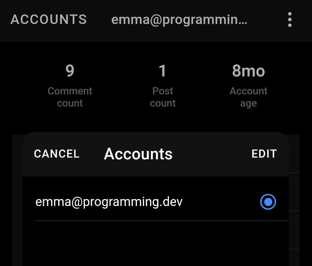
All caps is a material design thing. ACCOUNTS is a button in this case, not a title. I’m assuming (although my knowledge is limited because I just downloaded the app) that this is intentional as material design is kind of the default Android look.
The same style is applied other places such as the “CANCEL” or “EDIT” buttons displayed here, so it isn’t just one place.
To be clear, I don’t know if they are following material design to a tee, but I do believe they might be taking inspiration.