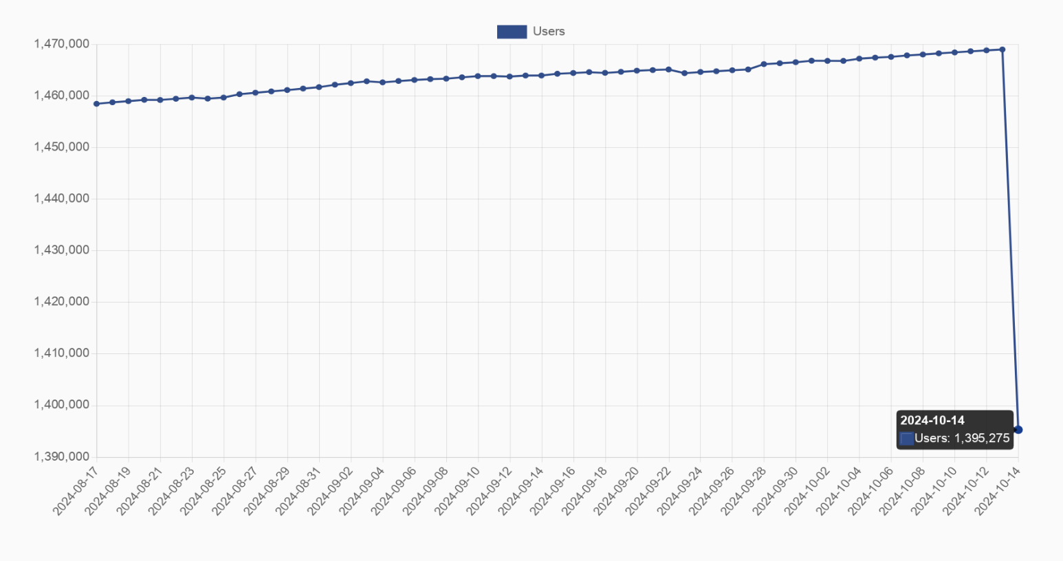
My point is that it is hardly visible and doesn’t show the exact numbers properly. I prefer the current style of graph for showing sudden changes if the previous data points isn’t that important in the context. But everyone has their preference I suppose.


It’s the only way to demonstrate the fall, of you did it at scale it would’ve even be noticeable.
deleted by creator
There are people here who didn’t even notice the axis and are confused. How do you expect everyone to notice a 5% drop lol.
deleted by creator
My point is that it is hardly visible and doesn’t show the exact numbers properly. I prefer the current style of graph for showing sudden changes if the previous data points isn’t that important in the context. But everyone has their preference I suppose.